\Imagery\
Is This What You Want?
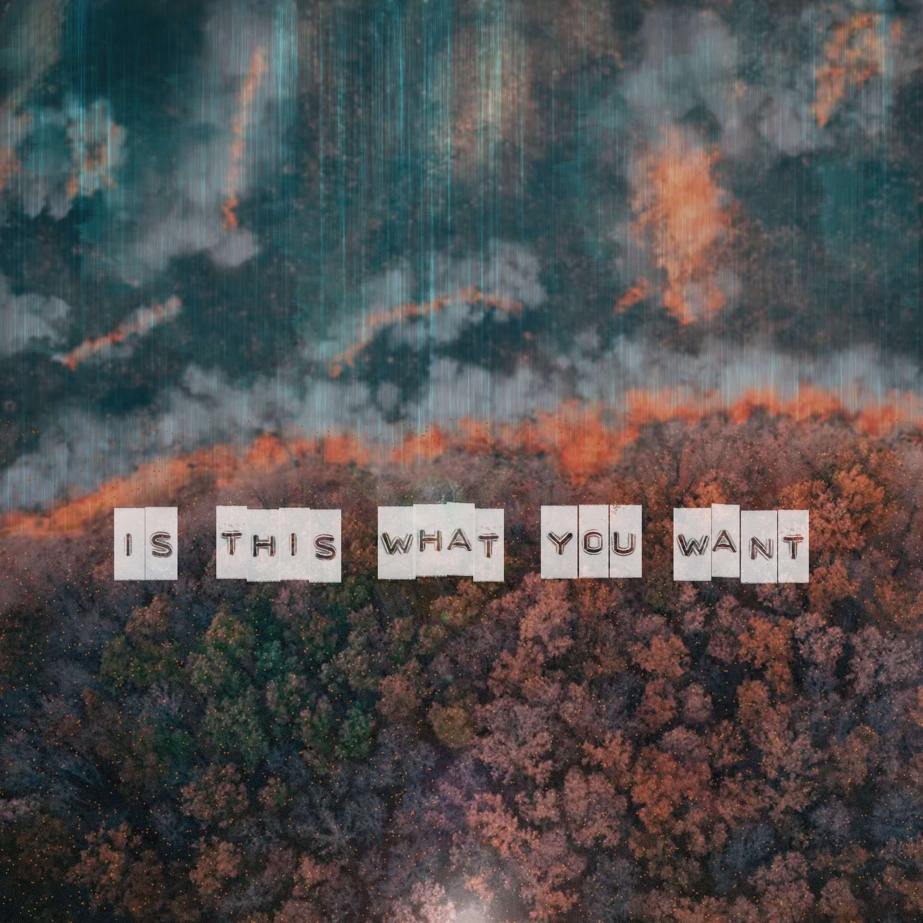
This came out a lot better than I was thinking. I wanted something to reflect the lyrics of the song. The song focuses on the idea that all the good in the world is slowly being overtaken by more and more sinister forces. It's about shouting at whatever religious belief you have as to why this is happening when you're told that good triumphs over evil. I had the thought that the recent forest fires and climate change was a good starting point.
The idea that a forest fire is wild and doesn't care what it destroys is the base. We can do all that we can to mitigate them, but it's a natural disaster that continues to happen partially due to our human actions. I added in some blue-green thread-like stuff over the destruction as a way to symbolize how our technological advancements have accelerated the wild fires. Now with the surge in building data centers for our obsession with LLM's we are going to see more issues related to this due massive increases in water consumption for a simple Google Gemini prompt. The slow overtaking of nature by technology lead me to use a labeler font as it's a product of older times left to die as well.
I did create a visualizer for this track just to try my hand at making something visual for once. I think it turned out alright, but I probably won't make more since it just isn't my thing.
New Logo Design
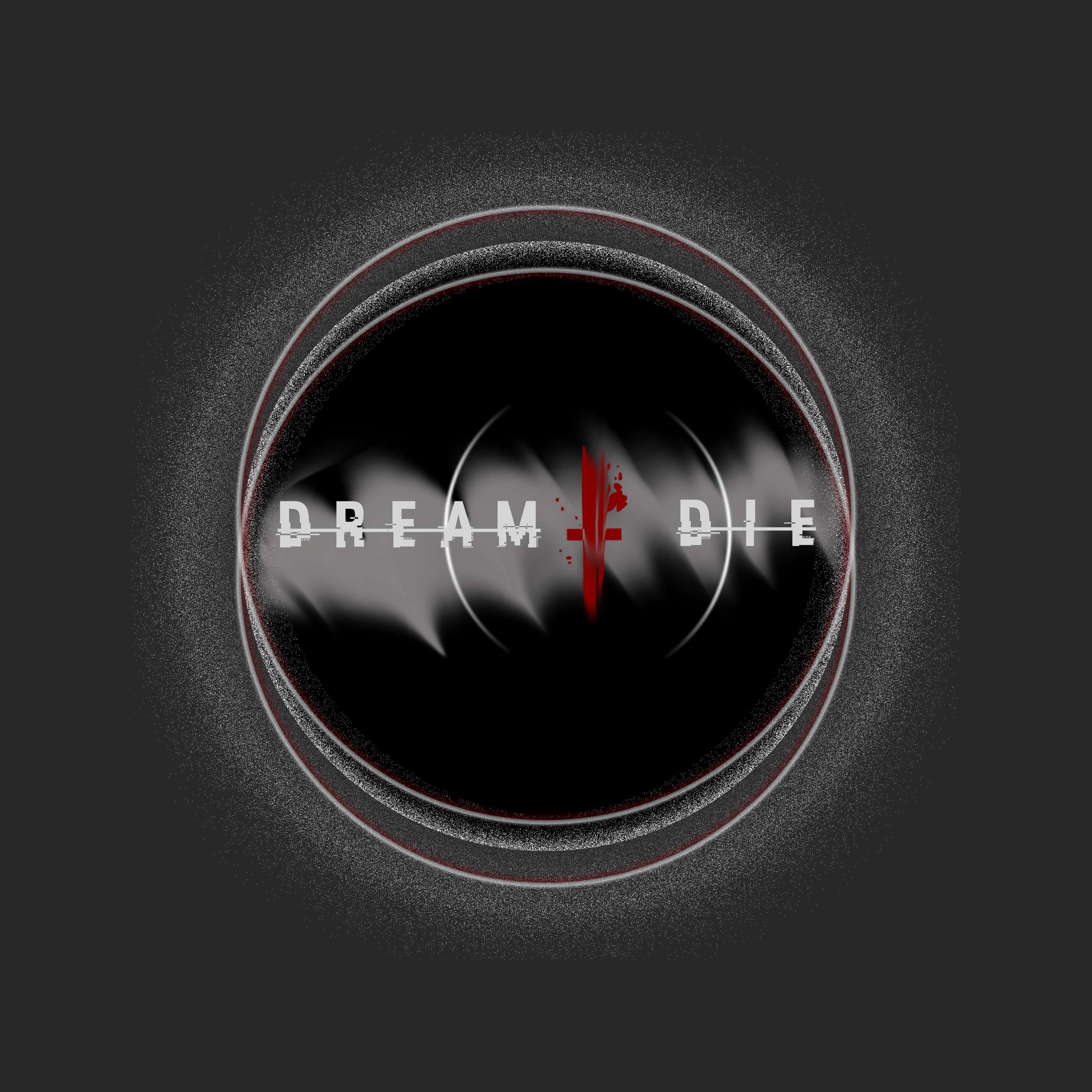
Lately I've been putting quite a bit of effort into creating a new logo using Photopea. I went through a lot of variations to get to this one and even then I feel like a logo is something that needs to be organic and be altered every so often.
I wasn't truly happy with my first rendition that I used for the 'Dystopia' release, but I did like some things about it. I kept the white brush stroke in the back, but did a lot of smudging and then heavy blurring to give the name a contrasting backdrop. I really wanted to add a small backdrop circle to the name since it looked kind of bland with just the words. I liked the parenthesis look since it reminds me of a planet outline. The last thing I needed to do was to make sure it the other two words fit which resulted in the offset look. In a way this is supposed to mimic a backwords and forwards letter D with the I being the middle line, or at least that was the original thought.
I started looking at eclipse tutorials and didn't quite want it to be as simple as 'followed tutorial, here's what I did!' So as usual I improvised on top of it and duplicated some layers to move up and down and finally came to this eye shape. Some of the grainy dissolved noise that I added to the center circle started to look like eyelids to me. The last thing I decided to do was to pull it off an all black background to a darker grey asphalt looking color. This let's the entire image pop a bit more, especially the inner logo design.
Taking on some of these challenges as a solo artist makes me feel like I have a lot to do all the time. In reality there is zero rush to any of this and all of it is another opportunity to grow and stretch my own artistic boundaries. We don't need to make something that we have to sell to another. These works can simply be about personal growth that you want to share with others. I encourage everyone to mess around and just create to express, and maybe one day it will resonate with someone.
So, what are you doing to stretch your artistic boundaries?
Dystopia EP Cover
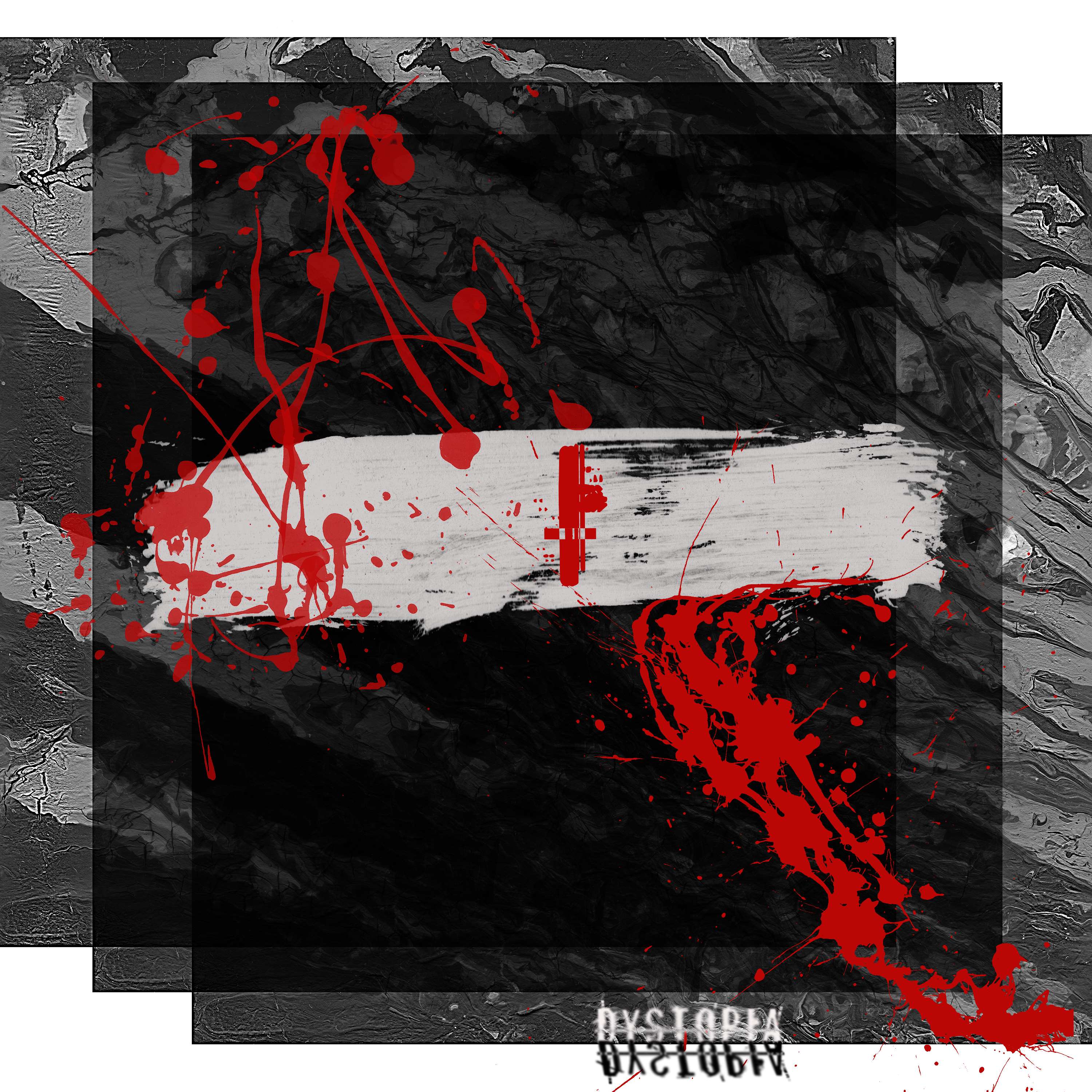
This took a bit of messing around in order to find the right initial imagery I wanted for the 'Dystopia' EP concept. I felt that monochromatic with a pop of color was best as it's devoid of feeling.
The minimalist movement has made it much easier to ease into the dystopian society as it reduces expression to its simplest form. Not having to choose what colors to use frees up brain power so we can work more.